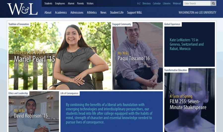
W&L homepage gets refreshed
November 2, 2014
Viewers can now read senior David Robinson’s work on the Student Judicial Council, senior Kate LeMasters’ study abroad experiences in Switzerland and Morocco and junior Paqui Toscano’s passion for literature all on the updated Washington and Lee website homepage.
The homepage was designed and created by the Office of Communications and Public Affairs as an effort to tell the story of W&L through the various programs the school offers.
“Our main goal is to convey a story about the university in a glance to our visitors,” Assistant Director of Communications Jessica Willett said. “I think that the people we have here are the best people to tell that story in the right way.”
After about a year of planning the new website was launched on Oct. 20. With its previous design, the website told individuals’ stories without tying in the university’s mission. But the new design showcases the breadth of activities that students partake in both on and off campus.
“We really are trying to focus on the personalities on campus, the students, faculty, and the staff, that make Washington and Lee such a great place,” Manager of Web Development Eric Owsley said. “We would especially love to get more profiles on young alums who are out there putting these themes into practice and living lives of consequence.”
The new homepage features six themes: transformative education, global experience, engaged community, tradition of innovation, ethics and leadership, and life of consequence. Each theme has individual student or class profiles to showcase how the University’s mission statement ties into life on campus. The web designers met with a group of senior administration to gather those themes based on the mission statement, strategic plan, and target audience.
The layout of the homepage follows a grid-like style with large hero images, which is a growing trend in higher education websites. The grid layout has proven successful in popular websites like Tumblr and Pinterest.
“It puts a really heavy emphasis on good photography,” Owsley said. “Students don’t always come back from internships and studying abroad with fabulous photography. So we wanted to come up with a design that maximized our use of any and all photos we can get ahold of.”
Owsley said that the new homepage is also more compatible with tablets and iPhones. The Office of Communications is in the planning stages for creating profiles featuring faculty and first-year students. The back pages of the website will also be redone this year in order to be compatible with the new homepage.
Our goal in the next year is to finish a complete migration into the new system so that every page will be responsive,” Willett said.


